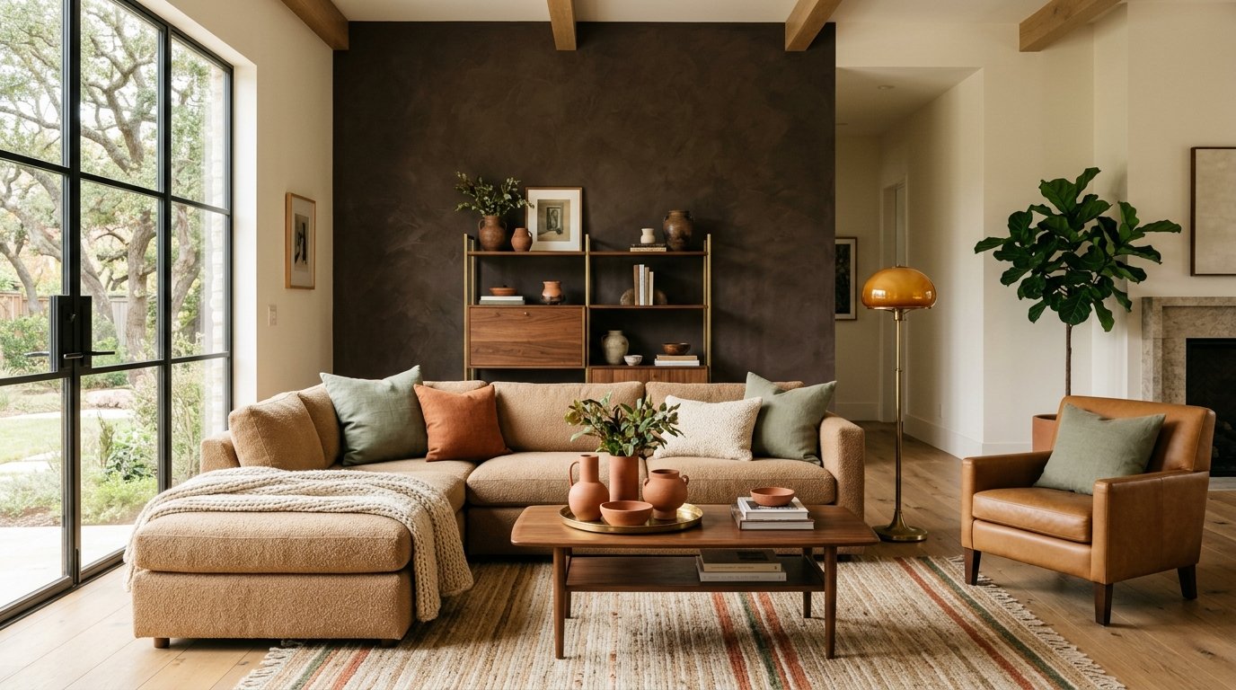
Every major paint brand went warm for 2026: Sherwin-Williams chose Universal Khaki, Benjamin Moore the espresso-brown Silhouette, Behr a smoky jade called Hidden Gem, and Pantone a soft warm white, Cloud Dancer. Gray had its decade; earth tones own the next. The catch: none of them will look on your wall the way they look on the chip.
The shift is more than a forecast. On Houzz, searches for rust jumped 178 percent and chocolate brown 153 percent year over year, and the American Society of Interior Designers named chocolate brown the top color of its 2026 report. Warm walls now read as current; cool gray reads as last decade.
What Each 2026 Color of the Year Actually Is
The four headline picks spread across the warm spectrum, from a near-white to a near-black. Each carries an undertone that decides which rooms it flatters and which it fights.
Source: 2026 Color of the Year announcements from Sherwin-Williams / HGTV Home, Benjamin Moore, Behr, and Pantone. Undertone behavior compiled from published color guides.
Why the Same Paint Looks Different in Every Room
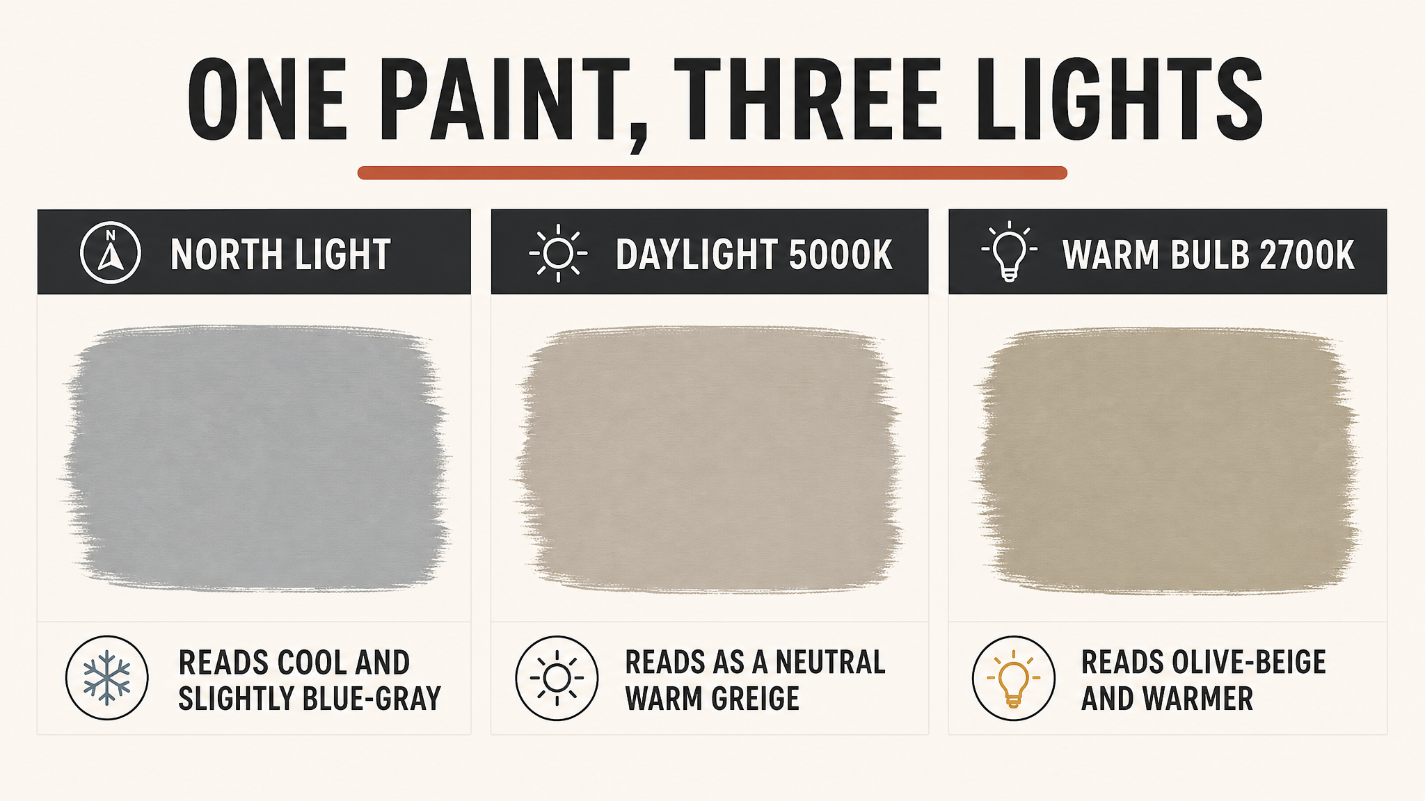
A paint color is not a fixed thing. It is pigment reflecting whatever light hits it, so when the light’s color temperature changes, the undertone your eye picks up changes with it. Designers call the effect metamerism, and the 2026 neutrals are unusually prone to it.
North-facing light is cool and blue-heavy, so it pushes a warm greige like Universal Khaki toward gray and flattens it. A 2700K warm bulb does the opposite, dragging the same swatch to olive-beige, while a 5000K daylight bulb lands closest to neutral. Whites, greiges, and taupes shift the most, which is exactly what the 2026 palette is built from.
Most rooms mix both sources: daylight through a window by day, warm bulbs after dark. A wall is really two colors in one day, which is why designers judge a swatch in the morning and again at night rather than once.
Which of the Four Belongs in Your Room
The right pick is less about taste than about light and room size. Universal Khaki is the low-risk choice for a bright, open living room, where its green base stays warm instead of sliding to gray. Pantone’s Cloud Dancer is the whole-house neutral when you want warmth without commitment.
Silhouette, the espresso, wants a bright room and a defined job: a single accent wall, a study, or the back of a bookshelf, where its depth reads as intentional rather than heavy. Behr’s Hidden Gem jade suits a north-facing room that feels flat, adding depth without the chill a cool gray brings.
Whichever you choose, hold the sample against the room’s fixed elements too. A warm oak floor can pull a greige yellow, and a cool quartz counter can make the same espresso read faintly purple. The wall never acts alone.
See the Color in Your Room Before You Commit
The fix is to judge the color where it will live, not in the store. Paint a large peel-and-stick sample or a two-foot square on the actual wall, and check it at morning, noon, and night.
A color that reads warm at 8 a.m. can turn muddy under lamplight. Catching that on a sample square is free; catching it after the whole room is painted is not.
This matters because a repaint costs the same as the first job: the U.S. average runs about $1,892 a room, with no discount for a do-over. Seeing the color in the room’s real light first, whether from samples or a rendering that shows how light reshapes a color in a space, is the cheapest insurance a paint project has.
The Warm Palette Also Sells
Warm color is not only a style call; it moves the sale. The same Zillow analysis that crowned chocolate brown also found that buyers now read cool gray as dated, the trait that once made it a safe default.
A saturated brown or jade lands best where it belongs: an accent wall, a bedroom, or a study, staged with the warm textures that help a home sell faster.
The move that backfires is painting for yourself and forgetting the next buyer. A saturated espresso you love can read as a room to repaint to someone else, so keep the boldest colors to accent walls and spaces a new owner can easily make their own.
Common Questions About the 2026 Colors
QWill a dark color like Silhouette make my room feel smaller?
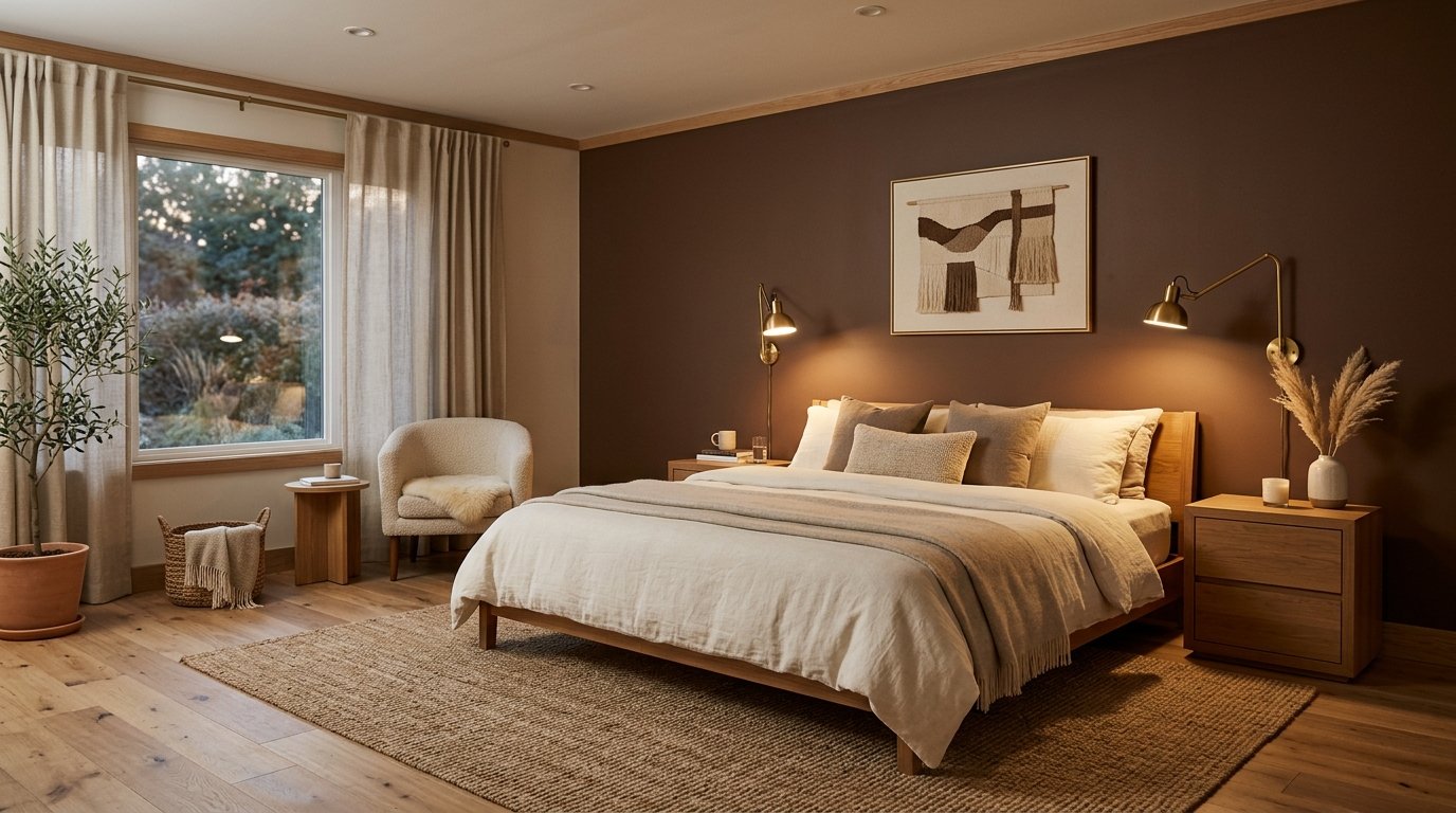
Less than most people fear, if the room has light. A dark wall recedes and can make a space feel deeper, but chocolate and espresso absorb light, so a room with one small north window will feel closed in. Reserve the darkest picks for bright rooms or single accent walls.
QHow do I use these colors without overdoing it?
The 60-30-10 rule keeps it balanced: 60 percent dominant color on the walls, 30 percent in upholstery and large textiles, 10 percent in accents. Run a warm 2026 neutral as the 60 percent, then let a chocolate or jade be the 10 percent punch rather than coating the whole room.
QDo I need extra coats to go from a light wall to espresso?
Usually yes. A big jump between light and dark needs a tinted primer plus two coats, and a dark-over-light job can need a third. Each extra coat adds about $50 to $70 per 300 to 400 square feet, one more reason to be sure of the color before the crew arrives.
The Takeaway
The 2026 Colors of the Year all point the same way: warm khaki, espresso, jade, and a soft white, with gray firmly out. The searches back it (rust up 178 percent, chocolate brown up 153 percent) and so does resale, where a chocolate bedroom adds $2,277 and warm exteriors sell six days faster.
But the color on the chip is not the color on your wall. Test the shade in the room’s real light at three times of day before you commit, because the paint is cheap and the repaint costs the same as the first coat.