Penn Station Renderings: What Must Work Beyond the Image
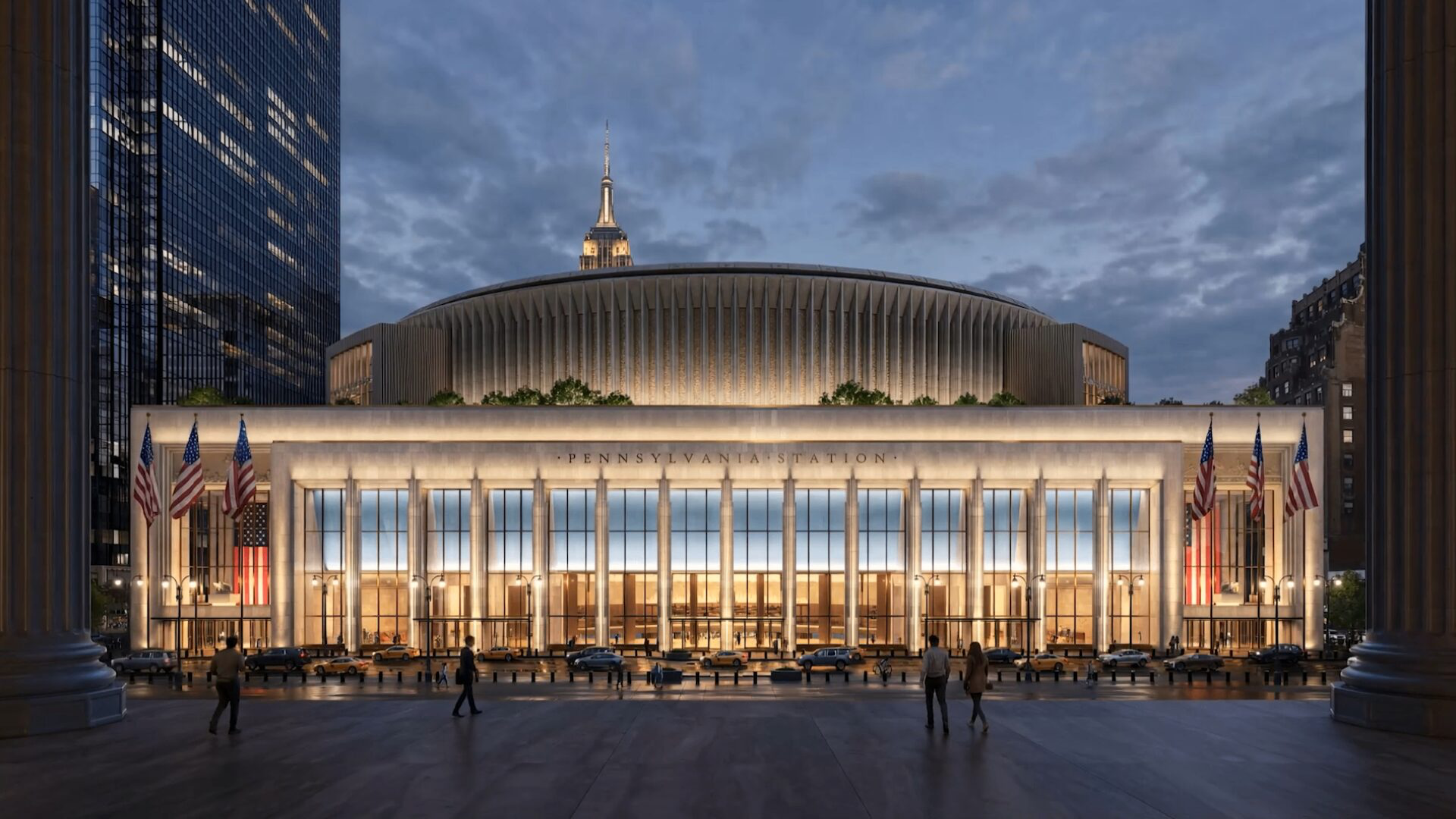
Penn Station’s new renderings promise a different commute for more than 600,000 weekday users: less time decoding corridors, more daylight, clearer routes and room to wait. The images are compelling because they turn those operational problems into visible space, but the project is still a proposal moving through design, funding and public engagement.
Amtrak, the U.S. Department of Transportation and Penn Transformation Partners released the design on June 8. The official scope names a new Eighth Avenue entrance, a single-level accessible concourse, improved circulation and at least limited through-running, meaning some regional trains could continue through the station instead of reversing there.
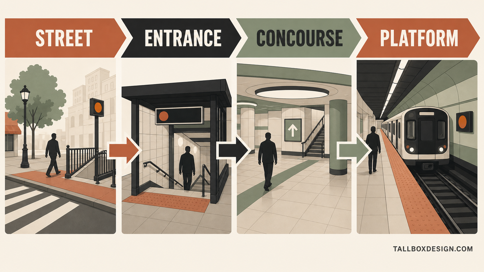
This guide helps a commuter or design reader judge the proposal on the right standard: whether the route from street to platform becomes easier to understand at the busiest moments, not whether a single rendered view feels grand.
Penn Station’s renderings make five passenger promises
A transit rendering earns attention when it shows what a rider could notice in seconds. Penn Station’s proposal does that with a large entrance, long sightlines and a consolidated public level, but each image needs a corresponding operational change to mean more than atmosphere.
Source: USDOT and Amtrak’s 2026 Penn Station transformation materials. The table separates stated project goals from outcomes that must be delivered.
A single-level Penn Station concourse must reduce decisions
Penn Station’s current difficulty is not only that it feels cramped. A traveler has to make several decisions in quick succession: which entrance is open, where the concourse begins, where to wait and which vertical route reaches the correct platform.
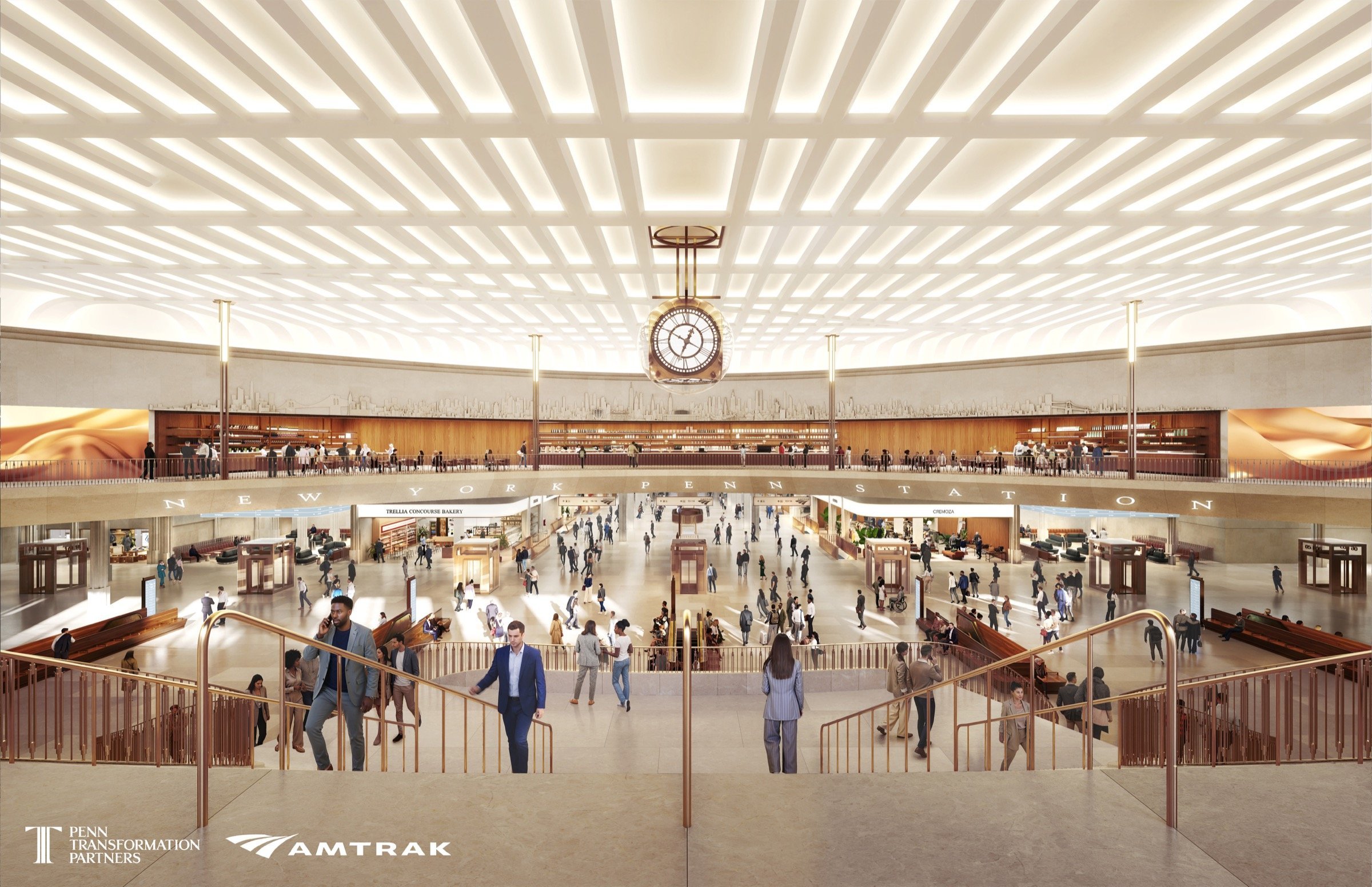
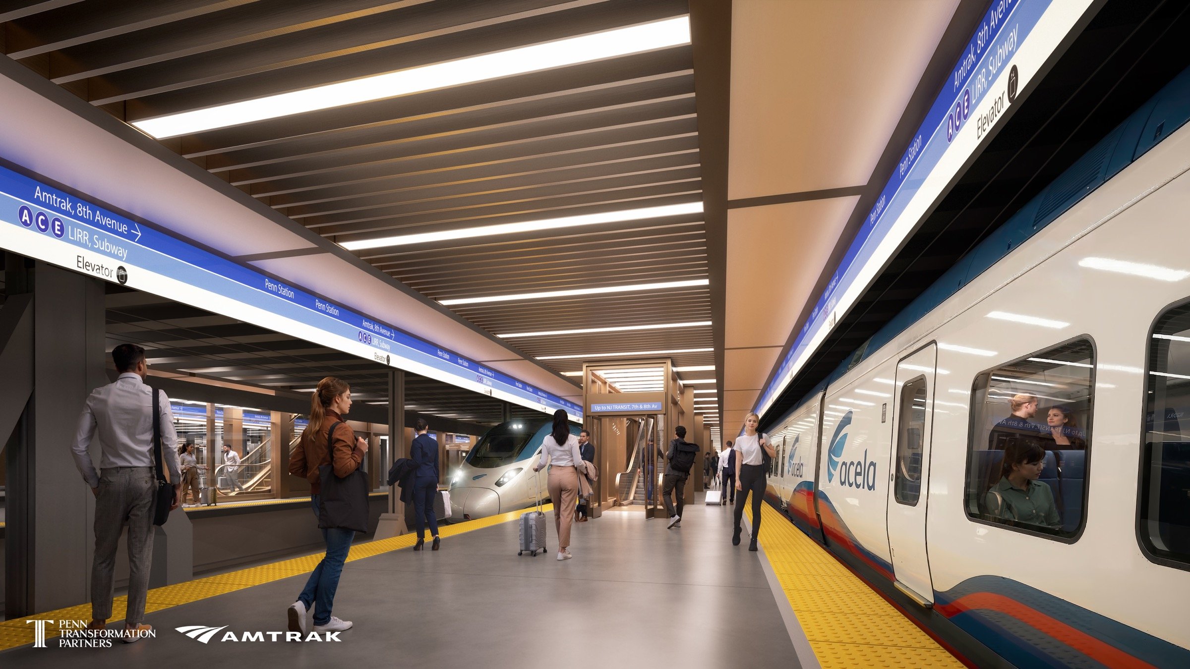
The proposed single-level public concourse addresses that problem by placing passenger activity on one understandable plane above the platforms. In visualization work, that is the difference between a beautiful interior and a space whose next move is obvious from the camera position a real person would occupy.
Penn Station’s 600,000 daily users need circulation, not a ceremonial room
USDOT describes Penn Station as the Western Hemisphere’s busiest transit hub, serving more than 600,000 daily commuters and visitors. That scale makes circulation the central architectural measure: a grand room succeeds only if it also makes queuing, crossing, waiting and changing modes less stressful.
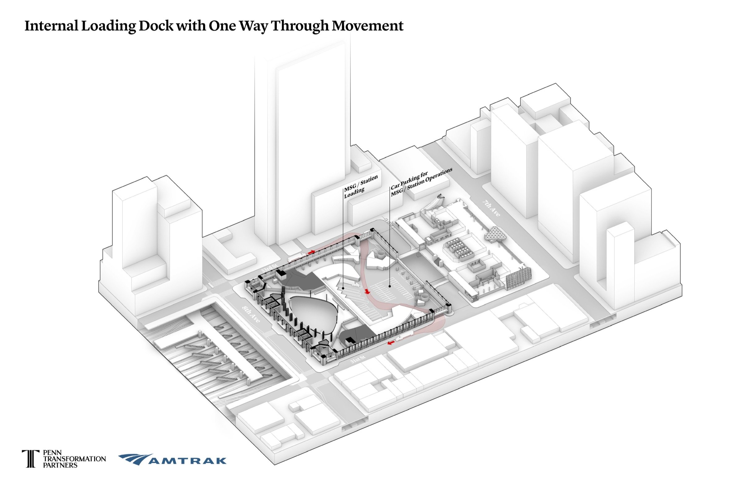
The proposal keeps Madison Square Garden in place. Keeping the arena changes the design challenge because the station has to find space, daylight and legibility inside an active structure rather than start from a cleared block.
USDOT says the project will replace cramped walkways with open concourses, expand waiting areas and remove dead ends. Those objectives give riders a practical way to evaluate later design releases: the improvements should be visible in route choices, not just in the size of the room.
Penn Station’s delivery questions remain visible
The official release targets groundbreaking by the end of 2027 and says community engagement continues through 2027. AP reported an approximately $8 billion preliminary estimate, while officials said a fuller cost breakdown would follow as design and environmental review advance.
That distinction matters because a station rendering can show a finished passenger experience long before the agreements, construction phasing and operational decisions that produce it exist. Penn Station should be read as a public design commitment with measurable delivery tests, not as a completion notice.
- Design: the current images establish direction, not a finished construction package.
- Funding: early grants for design and permitting are not a settled full-project budget.
- Operations: through-running remains a scope objective, not a completed service pattern.
How to read a public-project rendering before it is built
Public renderings are useful when readers treat them as a testable brief. Look first for the person-level promise, then ask what route, room, entrance or platform movement has to change for that promise to be true.
That habit applies beyond rail stations. A complex architecture project also needs images that explain what will work, not merely what will look impressive.
For a public project, the most useful next check is simple: compare the visual promise with the published scope, then watch whether later plans preserve the same entrance, circulation and accessibility commitments. That approach gives residents and commuters a more useful role than simply reacting to a facade.
The takeaway
Penn Station’s renderings are valuable when they make a future commute measurable: easier entry, clearer circulation and less uncertainty between street and platform. The project now has to carry those visual promises through design, review and construction.